Image

Young Lives data visualisations help make the complex, comprehensive dataset accessible, interactive and powerful by illustrating narratives around what it is that impacts children in poverty and how they might best move from surviving to thriving in life. We aim for these visualisations to prompt discussion, reflections and implications about how to break intergenerational cycles of poverty, and to improve the life situation of children and young people growing-up in our ever-changing world.
The data visualised is across Rounds 1 - 5 of the Young Lives household child survey. Also note that Young Lives has a pro-poor sample and rural and urban locations are not equally represented in the data. In each visualisation, we will specify from which survey rounds the data visualised is drawn from, and which cohorts. For more information about the design and sampling of all components of the Young Lives study, including selection and representation by location, please visit our research methods page.
We aim for visual coherency across our suite of data visualisations. We have adopted comparable self-select legends, drop-down selection boxes and more so permitting users to visualise our data at their own pace, permitting an exploratory experience. So keep clicking, hovering and scrolling to discover the extensive functionality of our data visualisations.
These data visualisations by no means canvas the entirety of Young Lives data but they offer an entry-point into our work and key areas of focus, mapped against the global sustainable development agenda. For those who are keen to extend this interested focus and access our data, please head to our Use our Data page for information on access to our public archive.
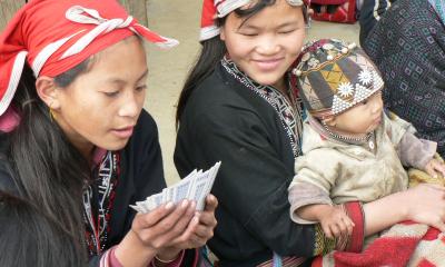
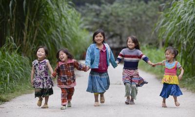
Our data visualisations have been developed around the research streams of nutrition, gender, education, and skills and work and visualise snapshots and progressions across our survey rounds (Round 1 in 2002; Round 2 in 2006; Round 3 in 2009; Round 4 in 2013; Round 5 in 2016) for children from both our Older and Younger Cohorts across our study sites in Ethiopia, India (in the states of Andhra Pradesh and Telangana), Peru and Vietnam.
In order to help navigate how we describe these narratives, please also see our data dictionary which defines measures, terms and specific assessment scales employed (such as dietary diversity and psychosocial wellbeing). The tooltip offers immediate definitions of variables and terms (see below).
Further to this, the data dictionary also sheds light on how we choose and employ data collection scales, limitations of these and signposts to ethical and representative considerations that have been central to our study.
The joys of tooltip! Our data visualisations give great importance to the humble mouse. Those interacting with our content via desktop or laptop browsers can scroll and hover over graphics to obtain dynamic information about the data behind the graphic, the variables being displayed against one another as well as country sites, year and sex amongst others. For those accessing our content via mobile devices, you are able to view static images of the default visualisation filters with framing text. However, the interactive functions are only available via desktop and laptop access.
The Young Lives data visualisations have been conceptualised, developed and produced by Marta Favara, Liza Benny, Kristine Briones and Grace Chang, with messaging and dissemination by Ana Bow-Bertrand (Communications Manager 2017-18). Thanks are also owed to the wider Young Lives staff and networks for their valuable inputs.
You are welcome to use these free of charge, in any format or medium, provided that suitable acknowledgment of Young Lives as a source is given, including: © Young Lives. Please notify us of any such use at younglives@qeh.ox.ac.uk.
This work is licensed under a Creative Commons Attribution-NonCommercial-NoDerivatives 4.0 International License
Young Lives data visualisations help make the complex, comprehensive dataset accessible, interactive and powerful by illustrating narratives around what it is that impacts children in poverty and how they might best move from surviving to thriving in life. We aim for these visualisations to prompt discussion, reflections and implications about how to break intergenerational cycles of poverty, and to improve the life situation of children and young people growing-up in our ever-changing world.
The data visualised is across Rounds 1 - 5 of the Young Lives household child survey. Also note that Young Lives has a pro-poor sample and rural and urban locations are not equally represented in the data. In each visualisation, we will specify from which survey rounds the data visualised is drawn from, and which cohorts. For more information about the design and sampling of all components of the Young Lives study, including selection and representation by location, please visit our research methods page.
We aim for visual coherency across our suite of data visualisations. We have adopted comparable self-select legends, drop-down selection boxes and more so permitting users to visualise our data at their own pace, permitting an exploratory experience. So keep clicking, hovering and scrolling to discover the extensive functionality of our data visualisations.
These data visualisations by no means canvas the entirety of Young Lives data but they offer an entry-point into our work and key areas of focus, mapped against the global sustainable development agenda. For those who are keen to extend this interested focus and access our data, please head to our Use our Data page for information on access to our public archive.
Our data visualisations have been developed around the research streams of nutrition, gender, education, and skills and work and visualise snapshots and progressions across our survey rounds (Round 1 in 2002; Round 2 in 2006; Round 3 in 2009; Round 4 in 2013; Round 5 in 2016) for children from both our Older and Younger Cohorts across our study sites in Ethiopia, India (in the states of Andhra Pradesh and Telangana), Peru and Vietnam.
In order to help navigate how we describe these narratives, please also see our data dictionary which defines measures, terms and specific assessment scales employed (such as dietary diversity and psychosocial wellbeing). The tooltip offers immediate definitions of variables and terms (see below).
Further to this, the data dictionary also sheds light on how we choose and employ data collection scales, limitations of these and signposts to ethical and representative considerations that have been central to our study.
The joys of tooltip! Our data visualisations give great importance to the humble mouse. Those interacting with our content via desktop or laptop browsers can scroll and hover over graphics to obtain dynamic information about the data behind the graphic, the variables being displayed against one another as well as country sites, year and sex amongst others. For those accessing our content via mobile devices, you are able to view static images of the default visualisation filters with framing text. However, the interactive functions are only available via desktop and laptop access.
The Young Lives data visualisations have been conceptualised, developed and produced by Marta Favara, Liza Benny, Kristine Briones and Grace Chang, with messaging and dissemination by Ana Bow-Bertrand (Communications Manager 2017-18). Thanks are also owed to the wider Young Lives staff and networks for their valuable inputs.
You are welcome to use these free of charge, in any format or medium, provided that suitable acknowledgment of Young Lives as a source is given, including: © Young Lives. Please notify us of any such use at younglives@qeh.ox.ac.uk.
This work is licensed under a Creative Commons Attribution-NonCommercial-NoDerivatives 4.0 International License